Giwang Sumsel — UI Case Study
Redesign of the Official Tourism App of South Sumatra Province
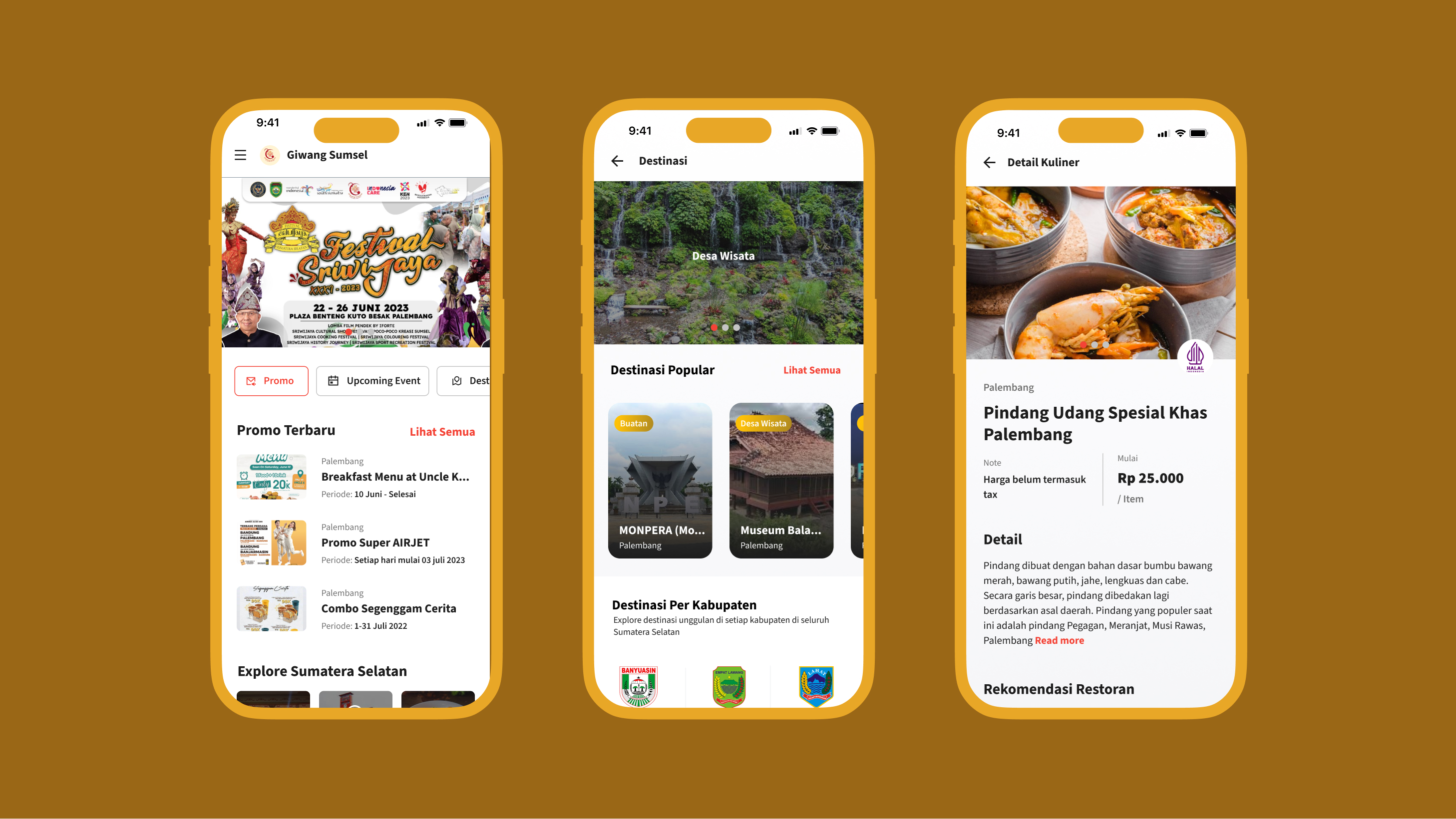
Figure 1: High-fidelity visual mockup showcasing the designed interface.
| Platform | Role | Method | Tools |
|---|---|---|---|
| Mobile App (Android) | UI Designer | Heuristic Evaluation + Benchmarking | Figma |
Overview
Giwang Sumsel is the official tourism app of South Sumatra Province, serving as a digital hub for locals and tourists to access information on destinations, culinary spots, promotions, and cultural events.
The client requested a full redesign covering 5+ screens. Due to time and budget constraints, direct user research wasn’t conducted. Instead, I ran an expert evaluation using established UX frameworks, supported by competitor benchmarking and secondary research from real user reviews.
Problem
The app competed with commercial tourism apps where users already expect high UX standards. The existing version had fundamental issues that hurt the experience.
User reviews on Google Play revealed recurring complaints:
- Hard to find information due to unintuitive navigation
- Visual design felt outdated and didn’t reflect South Sumatra’s cultural identity
- Homepage was too dense with no clear content hierarchy
- No content filtering or categorization
Expert Audit
I evaluated the existing screens using Nielsen’s 10 Heuristics. Key findings on the Home screen:
Heuristic 1 — Visibility of System Status No loading indicators. Users had no feedback while content was loading.
Heuristic 4 — Consistency & Standards Top tab bar showed 5 items but labels were cut off (“Kula…”) due to limited space. Users couldn’t read their navigation options in full.
Heuristic 6 — Recognition over Recall Content categories had no supporting icons. Users had to read every label instead of scanning — slowing navigation.
Heuristic 8 — Aesthetic & Minimalist Design The homepage displayed too many content types at once — breaking news, large photos, recommendations, social media — with no hierarchy. Everything competed for attention equally.
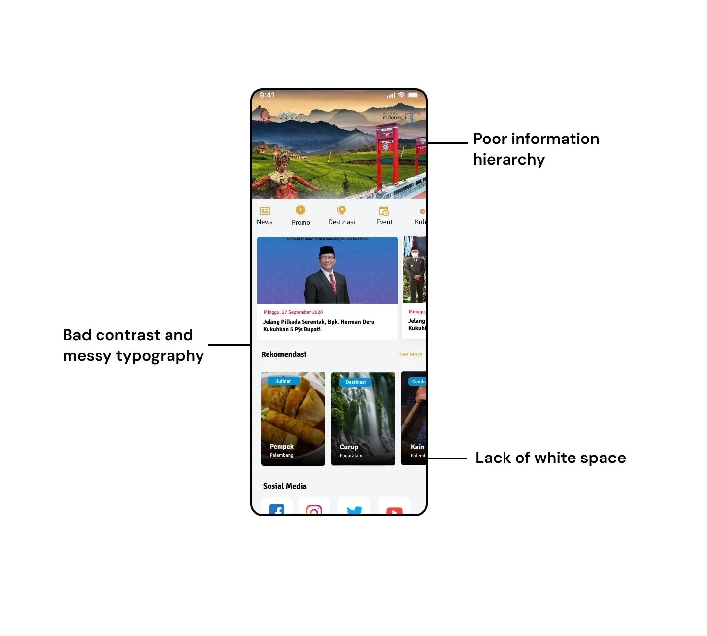 Figure 2: Annotation of heuristic issues discovered on the original homepage layout.
Competitor Benchmarking
I compared Giwang Sumsel against two regional tourism apps to identify proven UX patterns.
| Aspect | Giwang Sumsel (Before) | Wisata Jabar | Visit Lombok |
|---|---|---|---|
| Main navigation | Top tabs, labels cut off | Bottom nav + clear icons | Bottom nav + labels |
| Homepage content | News-heavy | Visual cards + filters | Banner + category grid |
| Local identity | Weak | Strong through photos | Strong through color & icons |
| Content filtering | None | By category | By destination |
Both competitors used bottom navigation and horizontal content filters — two patterns absent in Giwang Sumsel but already standard in mobile tourism apps.
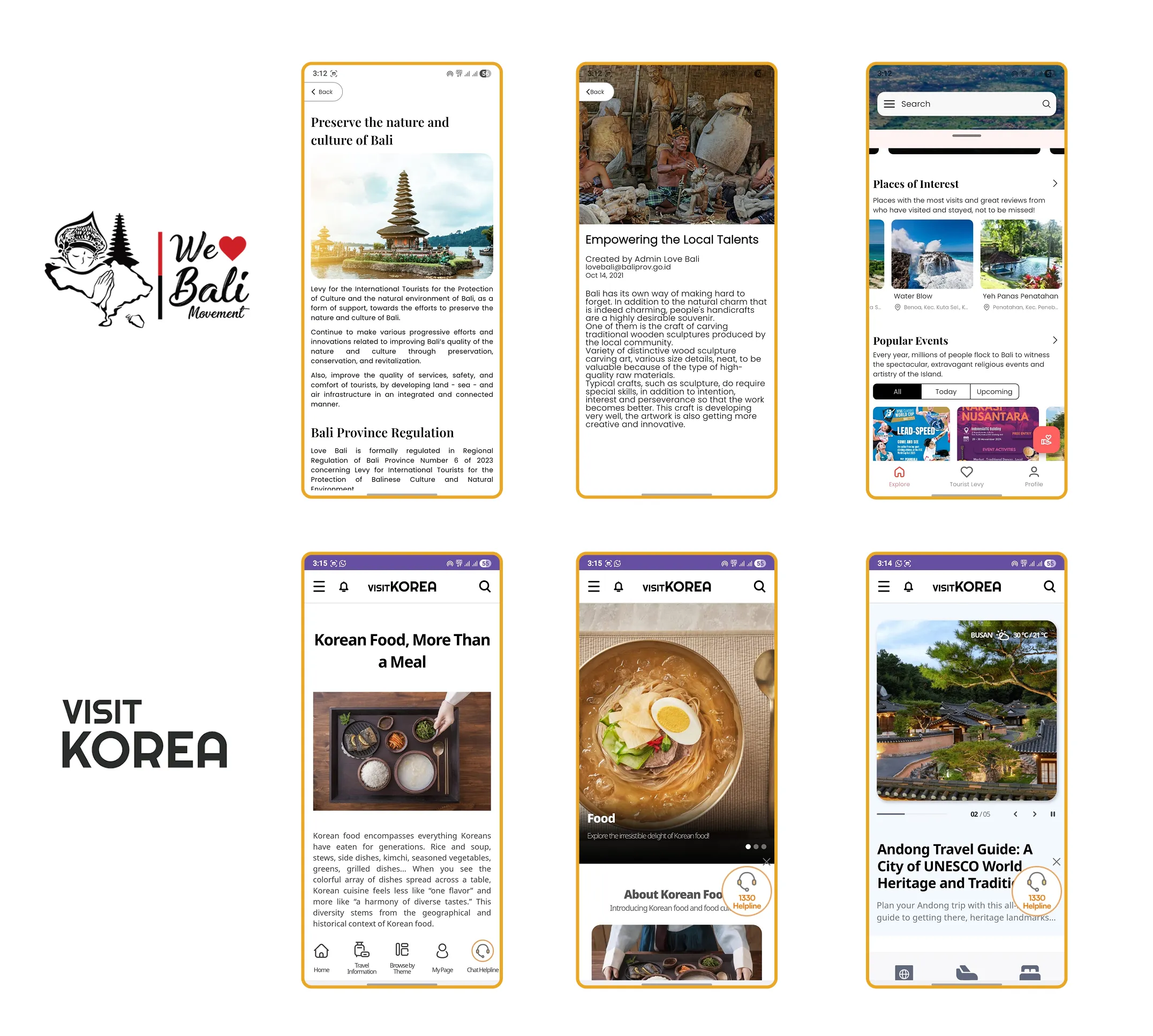 Figure 3: Key screen interactions and features analyzed from competitor apps.
Design Decisions
Every decision below came directly from the audit and benchmarking findings — not aesthetic preference.
Navigation — top tabs to bottom nav The old tab bar cut off labels and was hard to reach on large screens. Bottom navigation fixes both: labels are fully visible and it’s ergonomic for one-handed use on Android.
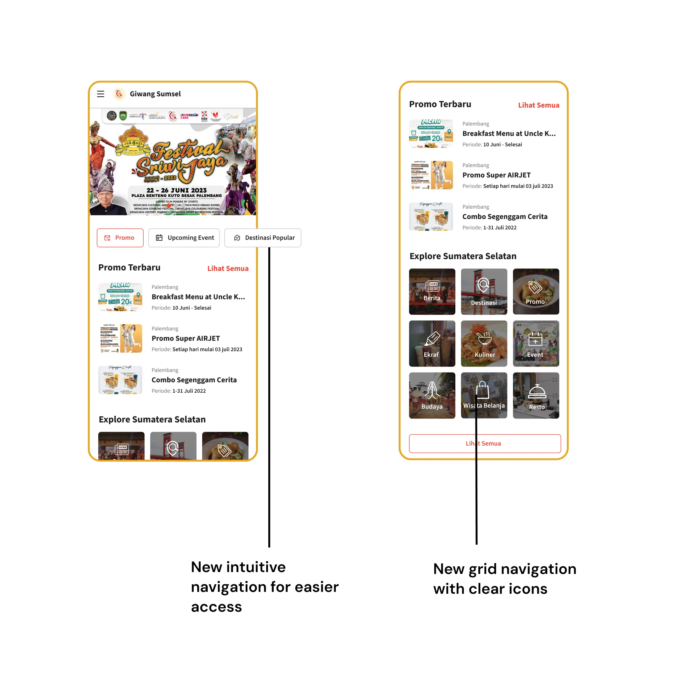 Figure 4: Redesign of navigation from cramped top tabs to ergonomic bottom navigation.
Card system — inconsistent list to standardized component Old recommendation cards were small with minimal metadata. The new card system uses larger thumbnails with location label, title, and validity period — letting users scan without tapping into each item.
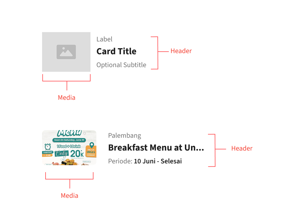 Figure 6: Redesigning and standardizing UI cards to improve scannability.
Design Principles
Four principles guided the redesign across all 5+ screens:
- Visual hierarchy first. Every screen has one clear focal point. The eye is guided from most to least important — not left to wander.
- Progressive disclosure. Not everything is shown at once. Filter tabs, “See All” links, and summary cards reduce cognitive load on primary screens.
- Component consistency. One card system, one navigation pattern, one type scale — applied consistently so users don’t have to relearn each screen.
- Authentic local identity. The design should feel like South Sumatra, not a generic tourism template. Colors, photos, and icons were chosen deliberately to reflect the region’s character.
Reflection
What worked
Heuristic evaluation surfaced real issues that were later confirmed by Play Store reviews. Competitor benchmarking sped up decision-making by showing what patterns already worked in the market.
What I’d add with more resources
Usability testing with 5 users — even 30-minute sessions — would validate whether the navigation changes actually help users find content faster. I’d also propose A/B testing on card layout (list vs grid) to measure engagement on promo content.
Conscious trade-offs
I chose list view for promo cards because it’s more scannable and shows more metadata per item, even though grid view is more visually striking. Bottom navigation was capped at 4 items to avoid overcrowding — the 5th category is accessible through an explore page.
Outcome & Key Improvements
Deliverables: 5+ screens fully redesigned (Home, Promo, Destination, Event, and Content Detail).
Key design improvements implemented:
- Intuitive Navigation: Bottom navigation replacing the truncated top tab bar.
- Clear Content Hierarchy: Clean separations between news, promos, and events.
- Consistent Card System: Standardized components with informative metadata.
- Stronger Visual Identity: Redesigned interface elements rooted in South Sumatra’s regional character.
- Horizontal Content Filters: Faster category exploration and less cognitive load.
Key Outcomes & Impact
- +50% — Tourist Registrations
- 4.8★ — App Store Rating
- 100+ — Mapped Heritage Spots